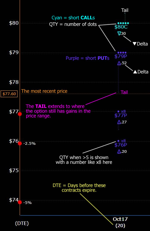
Let’s go in depth as to what each detail means.
Short CALLs (bearish intentions) are cyan in color. Typically short calls are sold above the price a little ways, with the hope that the price doesn’t quite reach that level by th expiry date.
Short PUTs (bullish intentions), I show them in Purple.
In both cases, the number of dots, or a literal x8 or x7 etc will be shown above the price point. This helps me see in an instant if it’s a tiny, small, or larger position.
The TAIL is a small indicator that helps me see where the position turns into a loss. For example, the $79 Short PUTs have a tail that extends down to around $77.65 which means that even if the price doesn’t reach $79, there could still be some gains if it’s close to this range. Remember, with Short PUTs we want the price to be above the Strike Price. Even it it’s only a few pennies above, that can be a 100% gain. With short calls, it’s the opposite.
▲Delta (or ▼) this is the “greek” that shows how close to the “money” the option is. When this number is low, it sort of reflects the unlikeliness of the point being crossed. Ideally, I want these all to be near 0.01 when the expiry date comes, but that is very unlikely with a setup like this one.
Price is shown by a simple flat line across the page. We know that it won’t travel in this way to the end, but it give an indicator as to where the positions sit in relation to it.
Red Dots down the left give an indication of what drops of 1%, 2.5% and 5% would place the price at.
DTE is the days to expiration of these contracts where they either must be closed, rolled, or left to expire worthless.
Ideal Outcome
In this particular set of options, the most ideal outcome would be to see the price come to around $79.30 – $79.50 by October 17th. There is a lot of ground between here and there though. A lot of Tweets, a possible government shut down, tariff announcements and other possible headwinds or tailwinds to making that happen.
There’s another tool I use to think about calculations when I am initially setting them up, and it’s good old Excel spreadsheets. Here’s a link to an article on how I use Excel to both setup, and follow up when desired on positions.
What if Scenarios.
If you download the excel sheet, you can edit and tweak the numbers yourself.